Tribeca Citizen
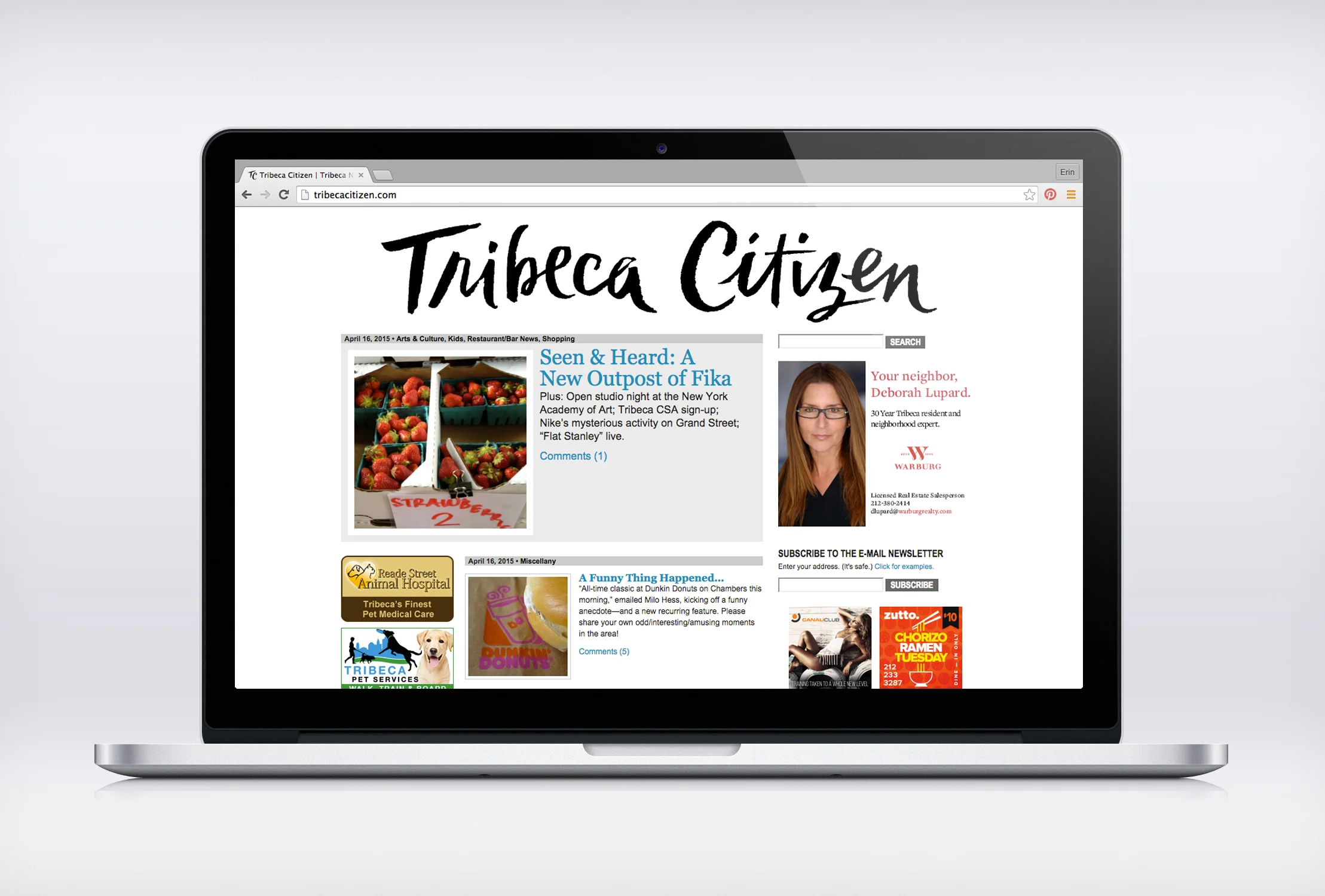
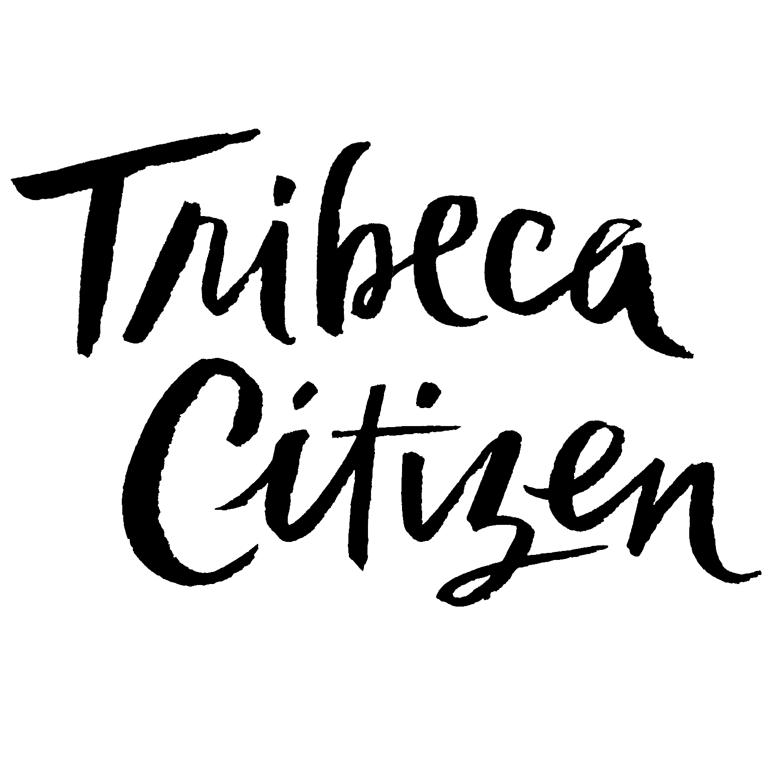
Hand lettered nameplate and web assets for Tribeca Citizen, an online newspaper based you-know-where.
Former magazine editor Erik Torkells started Tribeca Citizen out of his desire to truly get to know his neighborhood. The newspaper had been using a hefty slab serif masthead with an illustration of an industrial-looking warehouse building. Both of which Erik was tired of, and asked me to give the logo a makeover.
The new look was to be fresh, new, exciting, edgy, and basically everything the old masthead was not. The end result has both class and sass, a bit indicative of Erik himself from what I can tell. This was a super fun one!


